18 July 2018
Posted by Callie Sierra
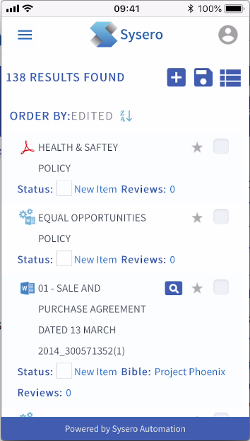
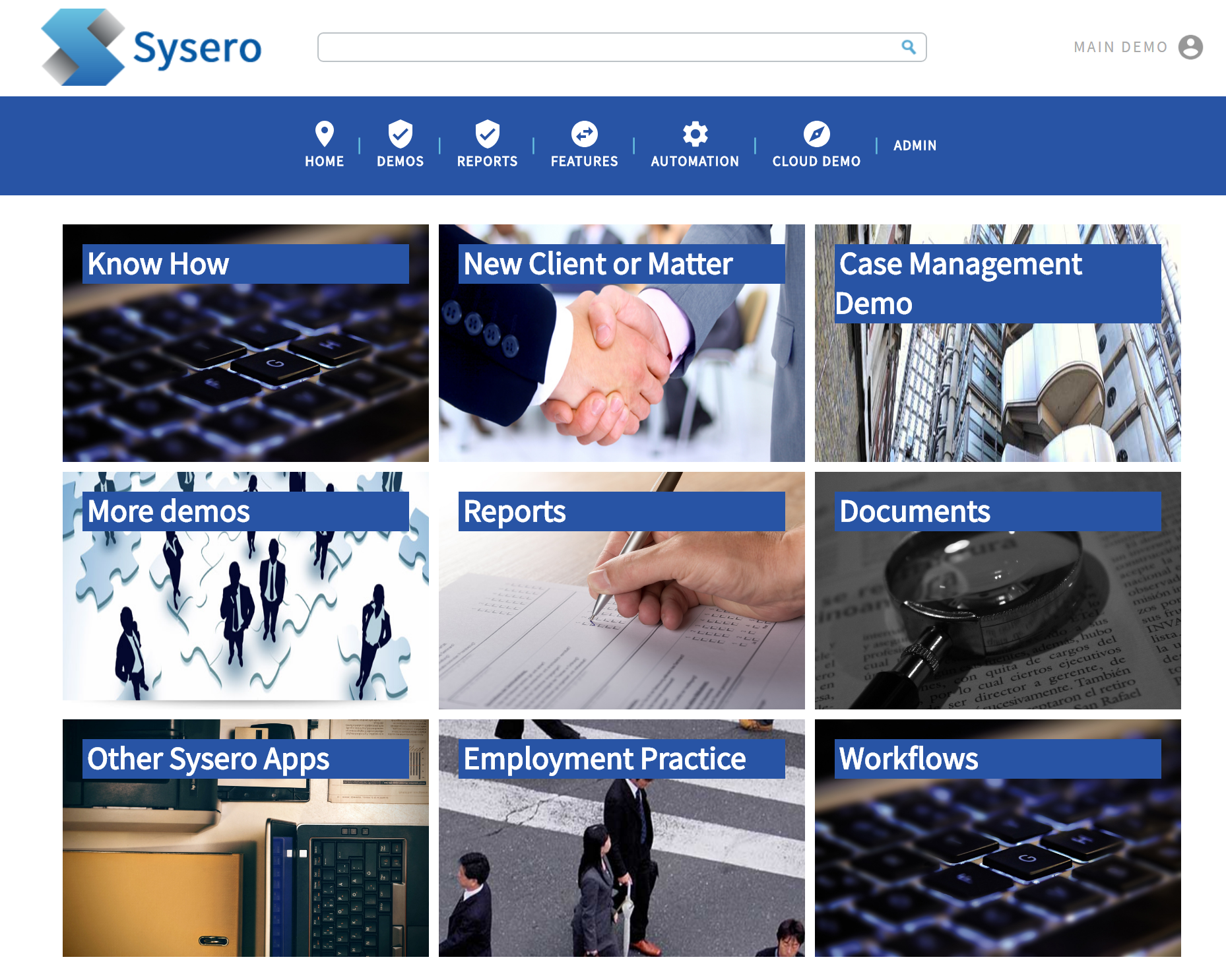
We’re pleased to announce the launch of Responsive TM, a new design layout now available for Sysero systems. Responsive TM is a clean, modern design that puts flexibility and accessibility front and center for the user. The new layout incorporates a simple dashboard design, icon-based menus and scrolling process indicators to make it easier for users to access the information most relevant to them. Responsive TM also boasts an enhanced responsive platform to allow users to easily access their Sysero systems from anywhere, on any device.
Fully Responsive Design
An improved responsive layout automatically responds to the needs of users and the device they’re using, whether it be a desktop, laptop or iPhone. The result is a fluid, consistent experience and greater accessibility across a range of devices and screens.

Beautifully Designed Dashboards
Minimal, design-led dashboards offer users a cleaner layout and quicker access to key information. The new layout also features icon-based navigation that serves as a visual guide to finding relevant information across the system.

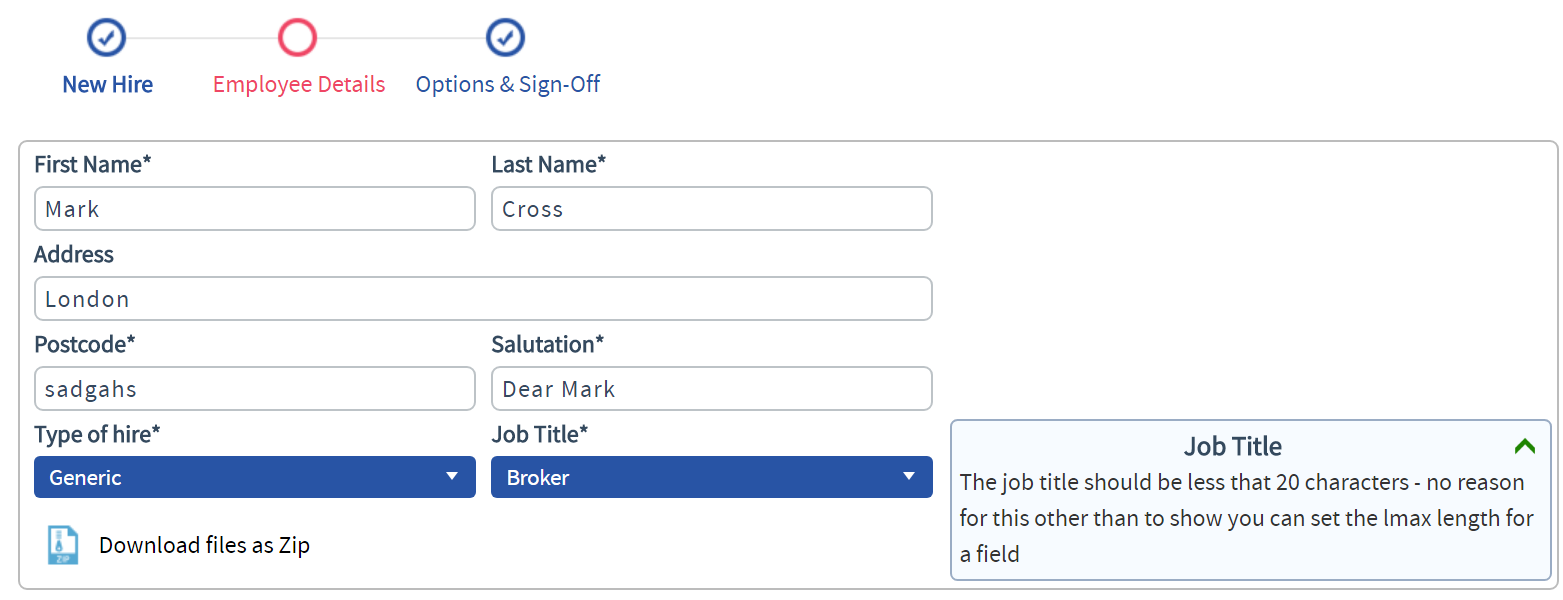
Visual Progress Indicators
Visual, scrolling progress indicators clearly indicate the steps involved in a creating a new document, while informing users of where they are in the process.

Completely Customisable
Responsive TM can be completely customised to suit your firm’s brand and use cases. Take advantage of our design service to create a bespoke design that seamlessly integrates your corporate look and feel.
To preview or gain access to the new look, get in touch with us. We’d be happy to walk you through a demo of the new design and help you determine the best way to customise it for your firm.